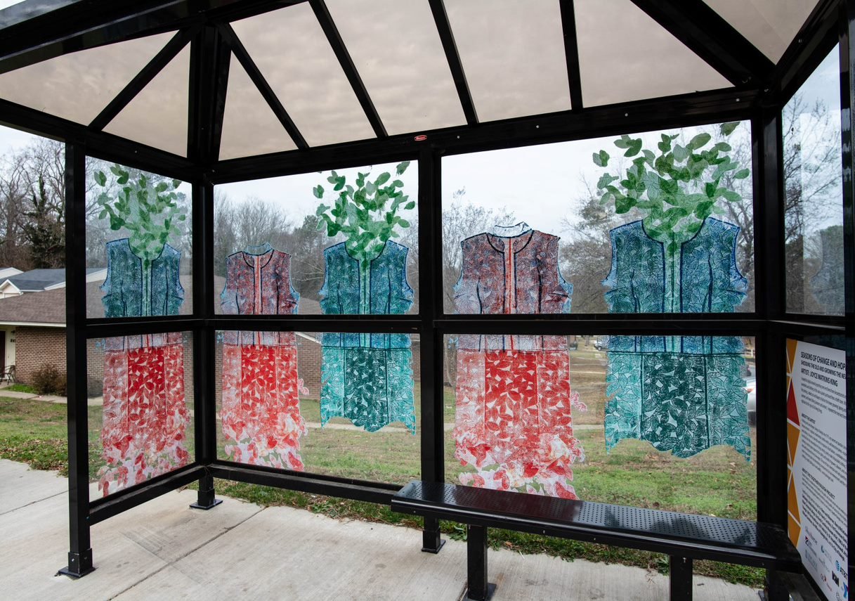
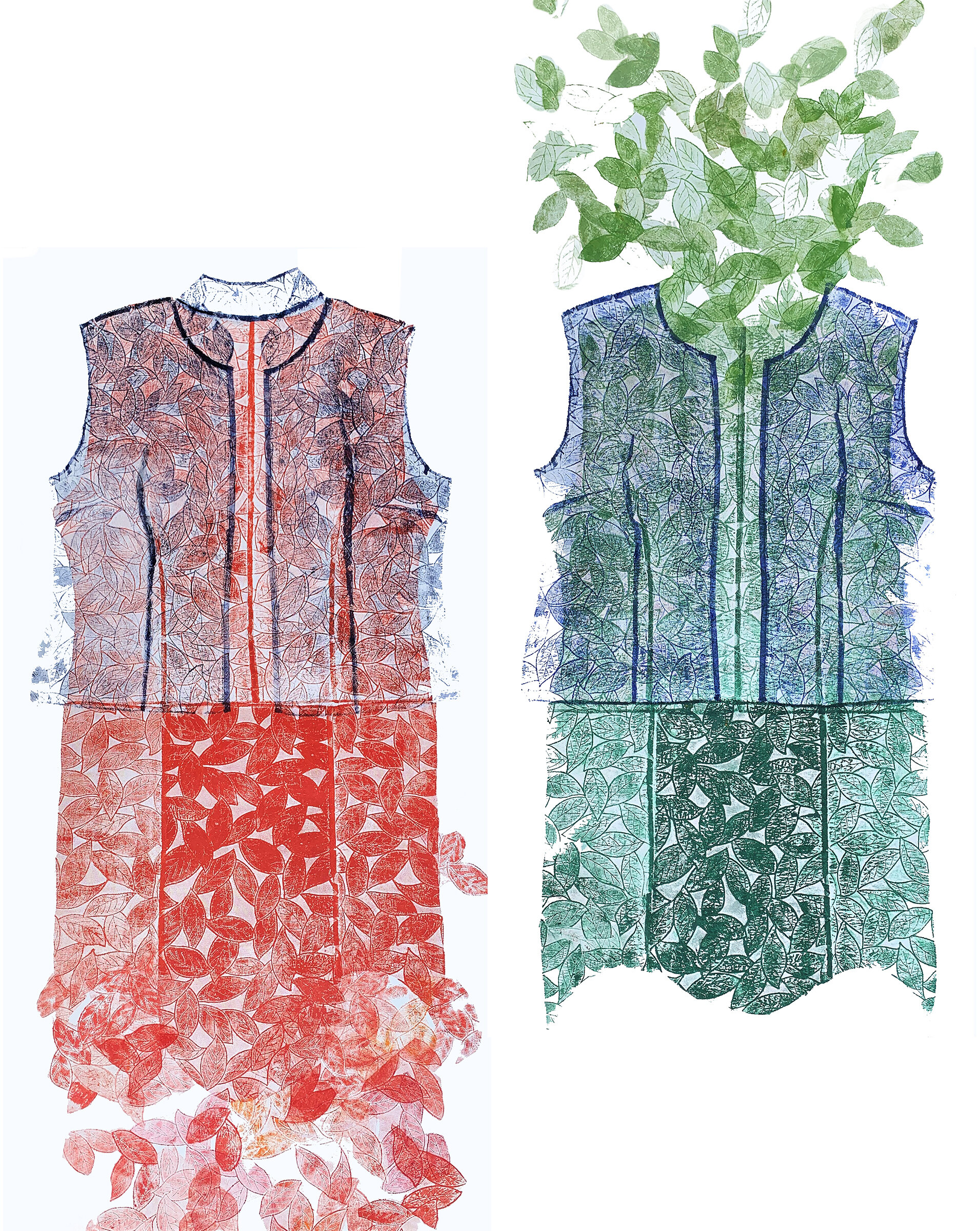
Commissioned by Raleigh Arts, I created this digital artwork by printing tree/vest forms from deconstructed and reassembled used clothing: in this case a jacket purchased from a thrift store. The artwork will be used on one of about 10 new bus shelters in downtown Raleigh in September 2020.
After printing the top and bottom panels of the vest form, I added cut leaf shapes to fashion the leaves growing (spring and summer) and leaves falling (autumn and winter). I repeated the tree/vest forms to replicate the life cycle of all living things. The background of the tree forms will be clear glass so that bus riders can easily see the approaching busses.
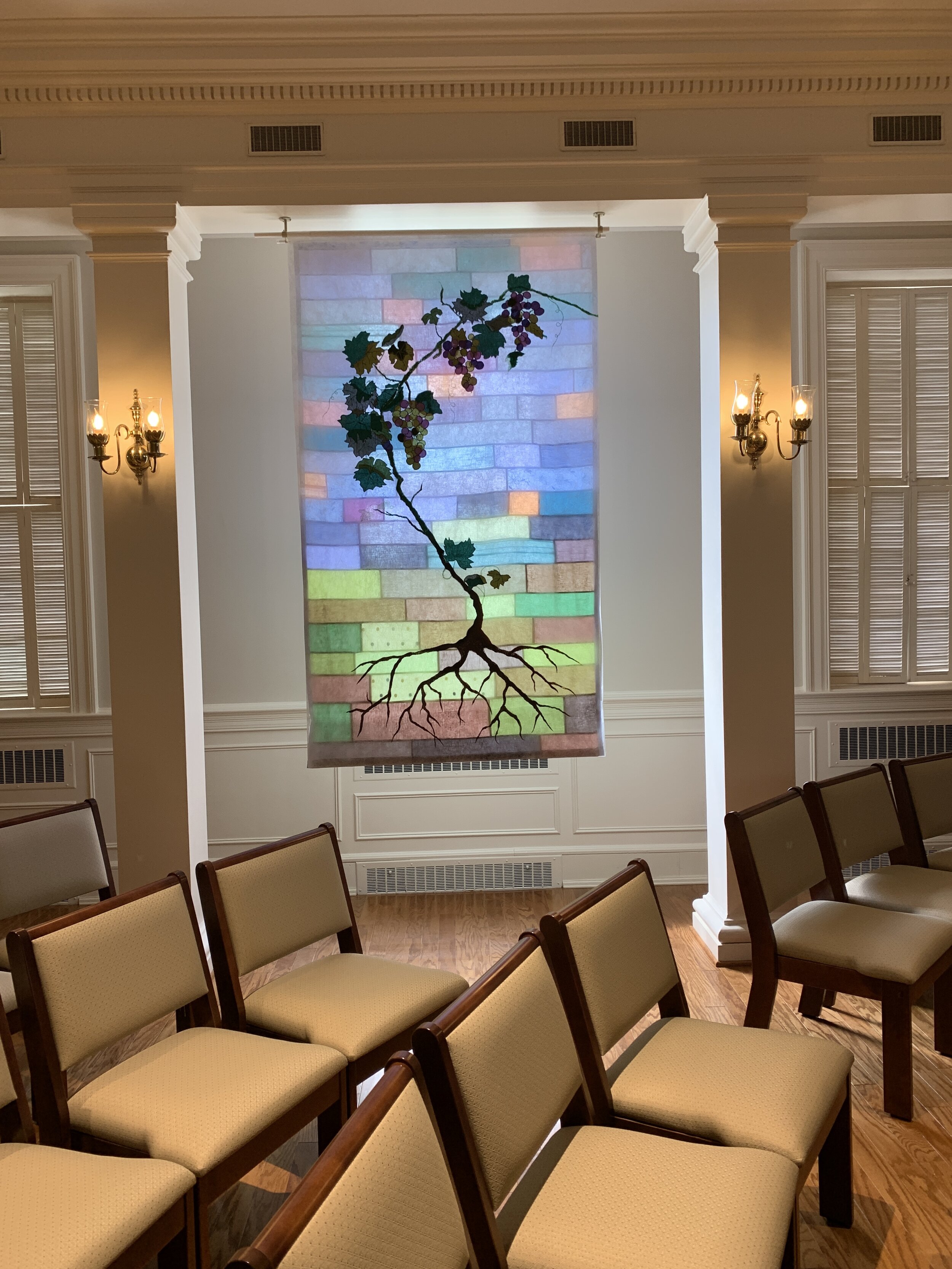
This 4-panels installation (2 shown here) was commissioned by First Baptist Church, Grreensboro, NC for the newly renovated chapel. They wanted a visual focal point for the neutral multi-purpose space that would be compatible with the variety of uses: weddings, funerals, lectures, small performances/concerts, etc. In keeping with my personal ethic to use recycled materials whenever possible, I made the 2 back panels out of linen from recycled garments using an ancient Korean sewing technique called bojagi/pojagi. The technique leaves no raw seams and when bac-klit, looks much like a stained-glass window. The front panels carry the imagery of the grapevine, also made from re-used linen, and embroidered to a sheer non-woven fabric.
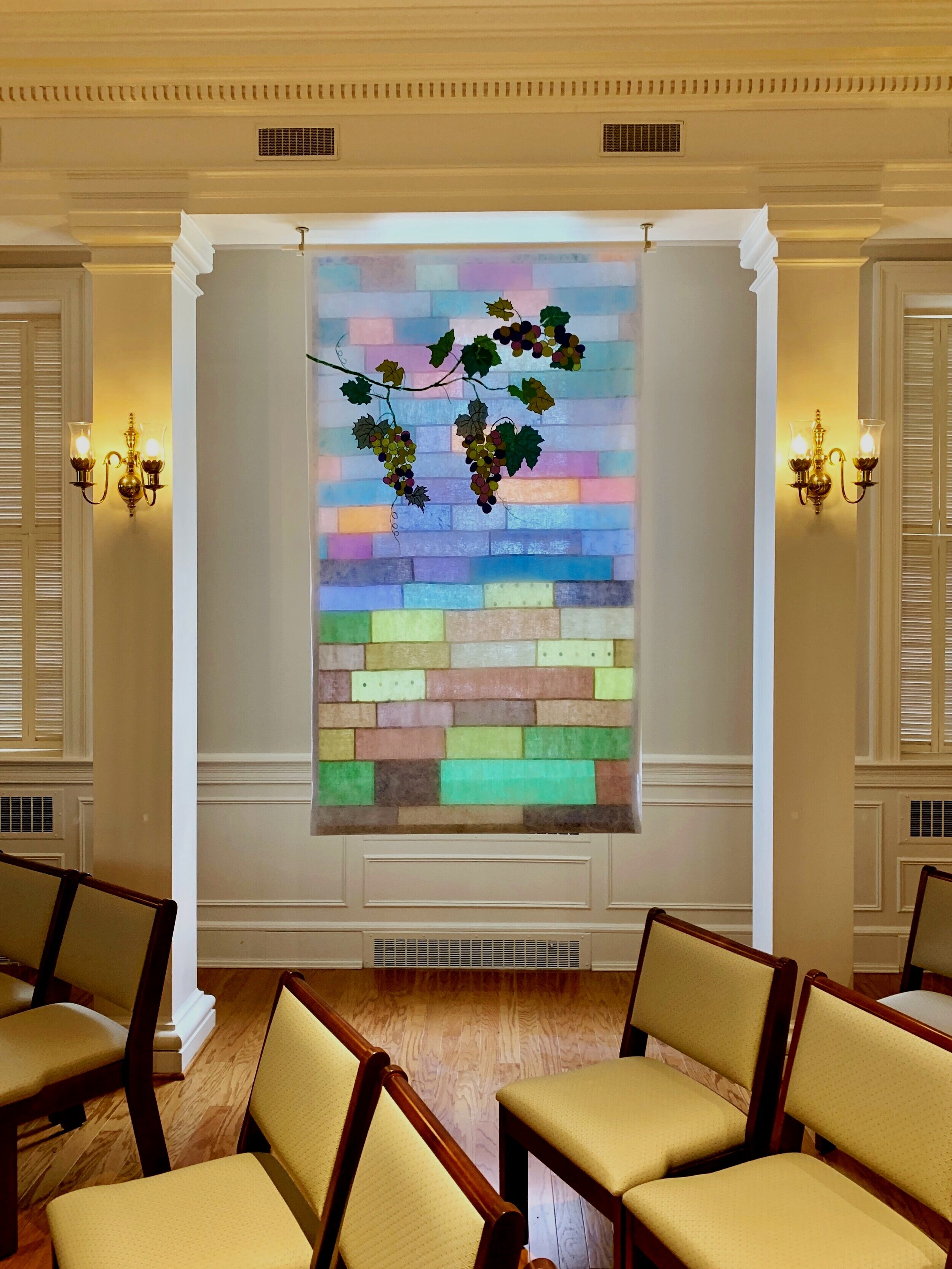
This is a view of the second half of the art installation. The top layer completes the grapevine imagery that flows from the first panel.
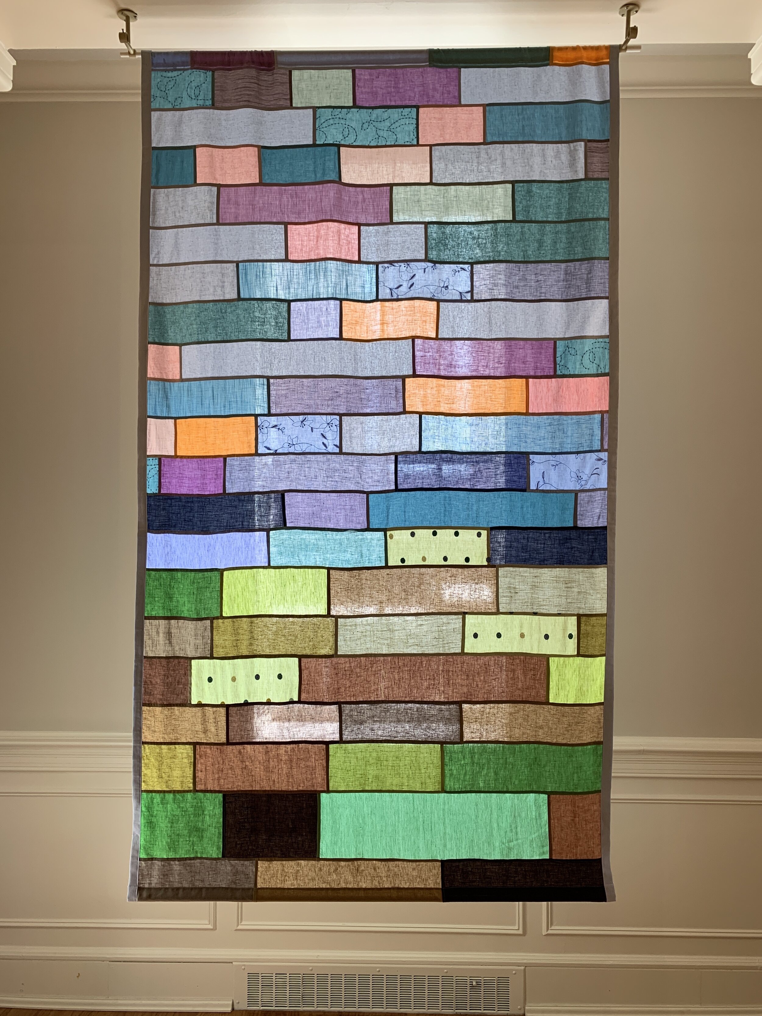
This image shows one of the two back bojagi/pojagi linen panels (84 x 52”).
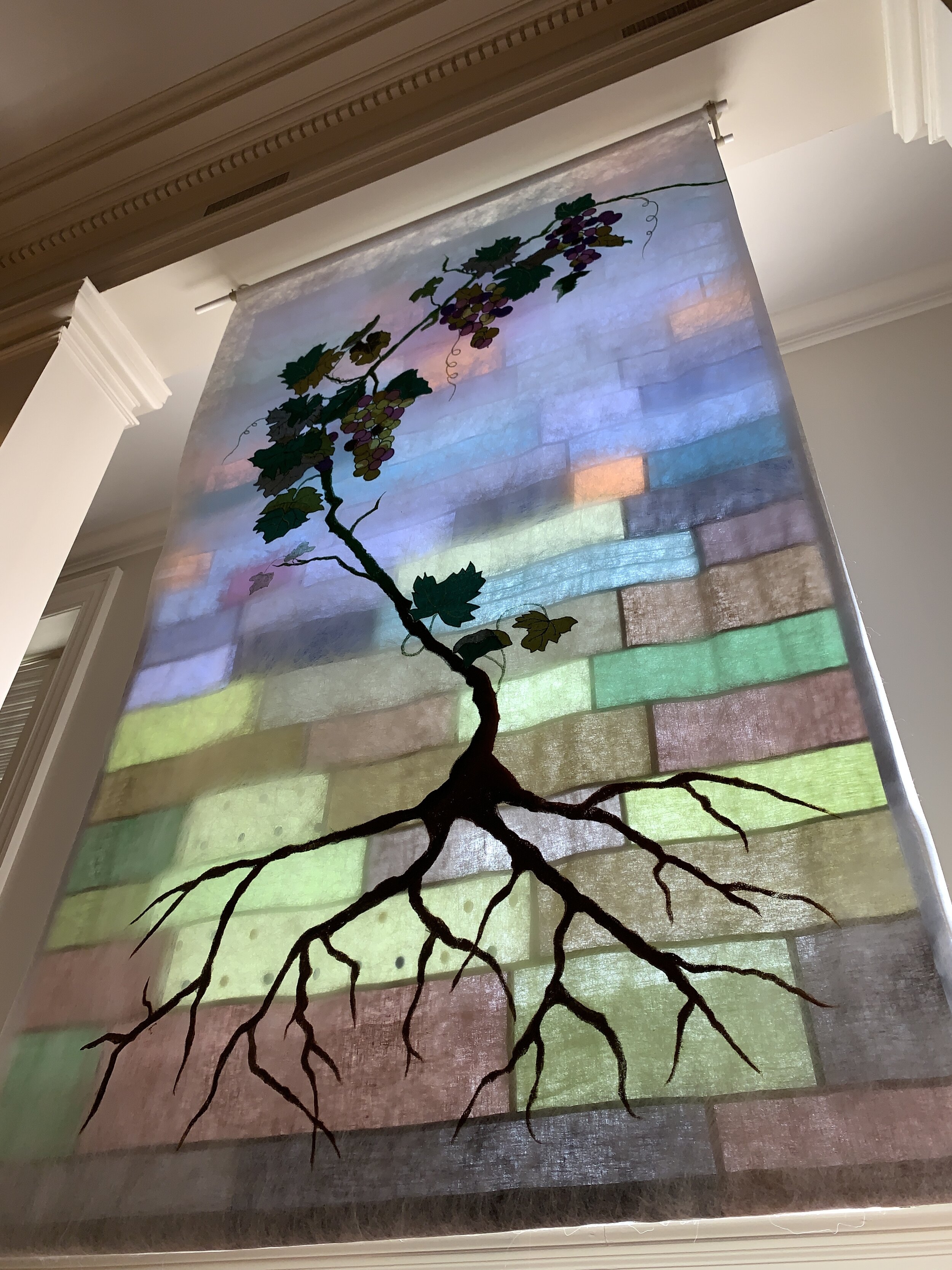
One of the beauties of this layered work is that it looks different from nearly every point in the room. For example this is how it might look to a toddler who is looking up at it from a close angle. Likewise the art changes all throughout the day, depending on when the light is coming directly, indirectly, or not at all from the window behind the work.
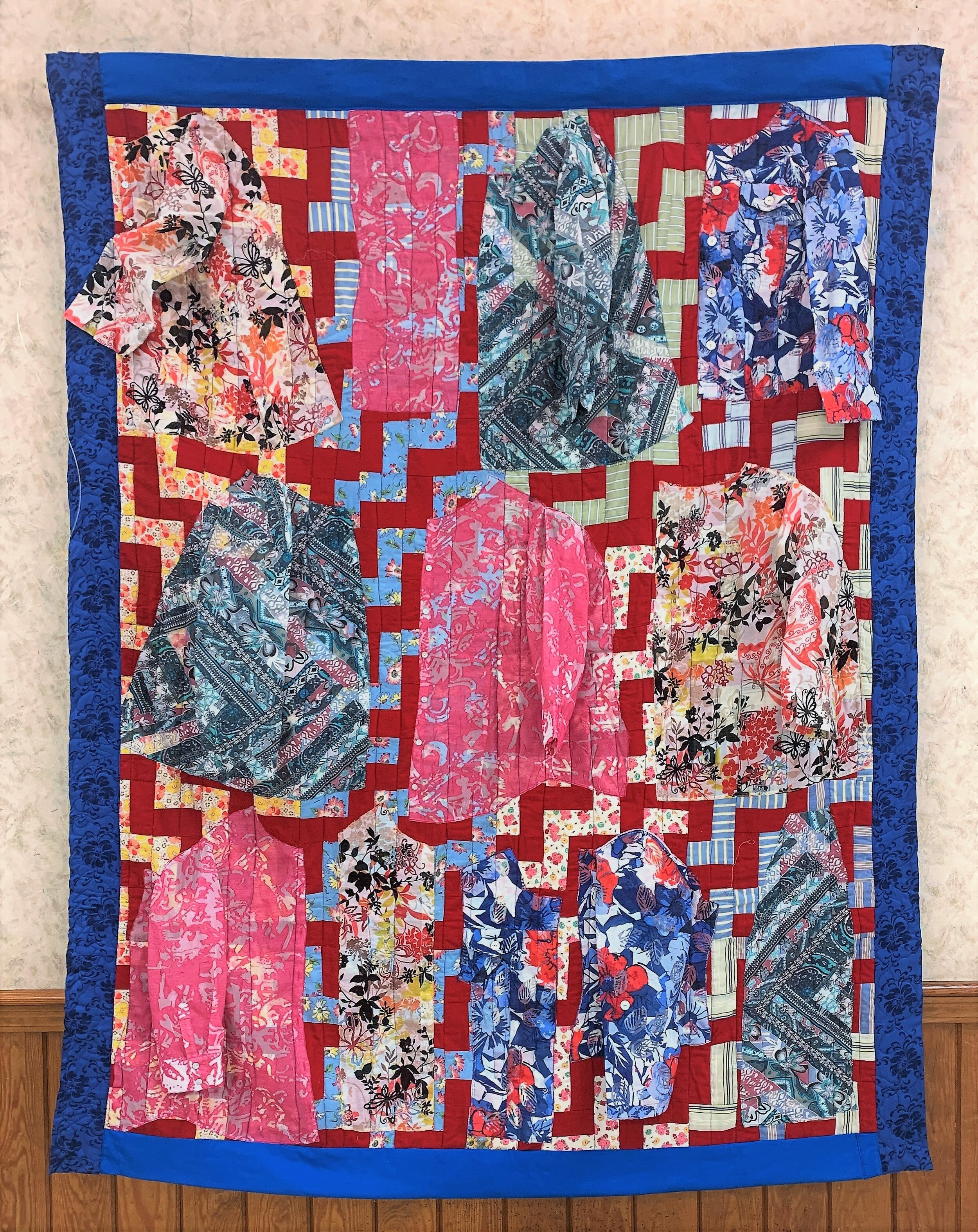
This 4-layered art quilt was created in response to an invitation from the NC Museum of History to myself and two other artists, to create a quilt in response to the quilts on display in their 2020 year-long exhibition, “QuiltSPEAK: Uncovering Women’s Voices Through Quilts.” The exhibition of some 80 quilts from the permanent collection reveals the voices of women long-silenced. Their quilts provide lasting records of life events, economy, style, status symbols and artistry.
I chose to pay homage to these phenomenal quilts with a creation that acknowledged the past and present. I began with a hand-sewn quilt top made from left-over bits of cotton clothing, given to me as a high school graduation present. Lovingly made by the Eunice, the African-American woman who helped my mother out with ironing every few weeks, I had been saving it for more than 40 years, and this seemed like a fitting way to honor her gracious gift.
Layered over the quilt top I embroidered minimally deconstructed women’s blouses, made from polyester burn-out fabrics, that allowed the quilt top to show through. I chose these garments, gleaned from thrift shops and my own closet, because they represent the opposite of the soft, natural fabrics used in the quilt base. These polyester garments that are now filling up our landfills at alarming rates due to mass consumption and the availability of cheap, poorly made fast fashion garments represent the opposite of thrift.
I wanted to convey how quickly these garments are purchased, worn briefly, and often thrown out when something as simple as a button falls off or they are no longer in style. I left the sleeves dangling as if these garment had been thrown on a bed or piled on the floor—devalued by their owner.
The border and backing fabrics were made from one of my wool skirts and an old throw. Only the thread and the interior batting were purchased.
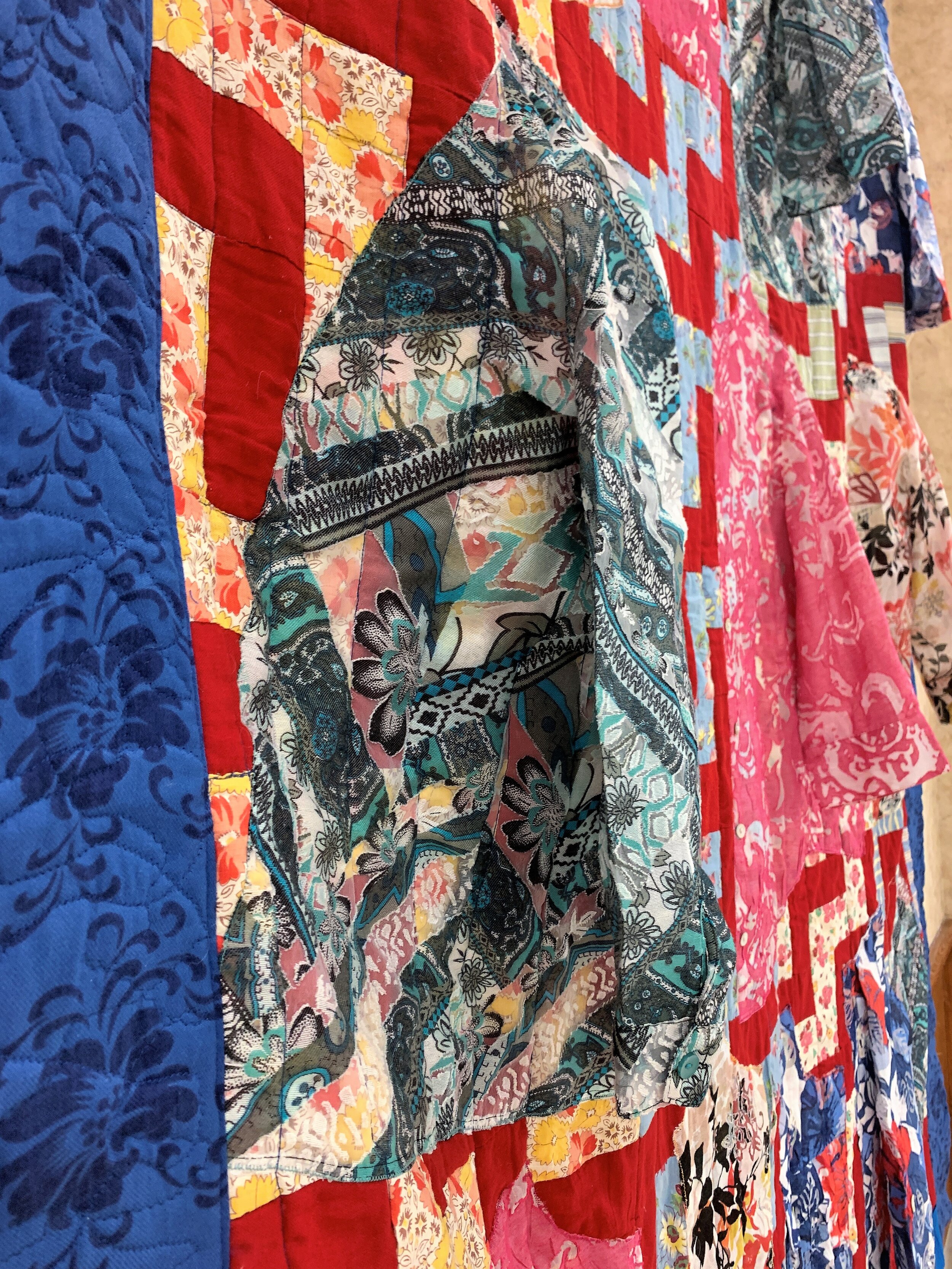
This view shows how the shirt sleeves hang freely from the quilt when it is displayed as art.
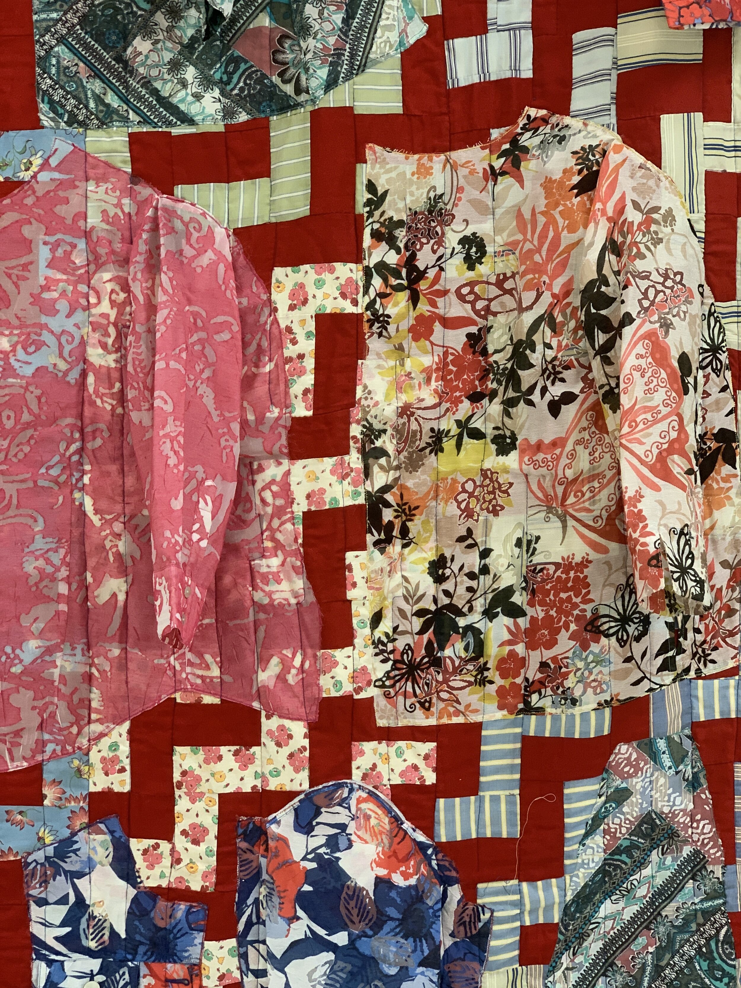
Here you can see how the polyester shirt panels have been layered over the old hand-pieced quilt top. The burn-out sections of the polyester fabrics allow the design of the quilt top to shine through.
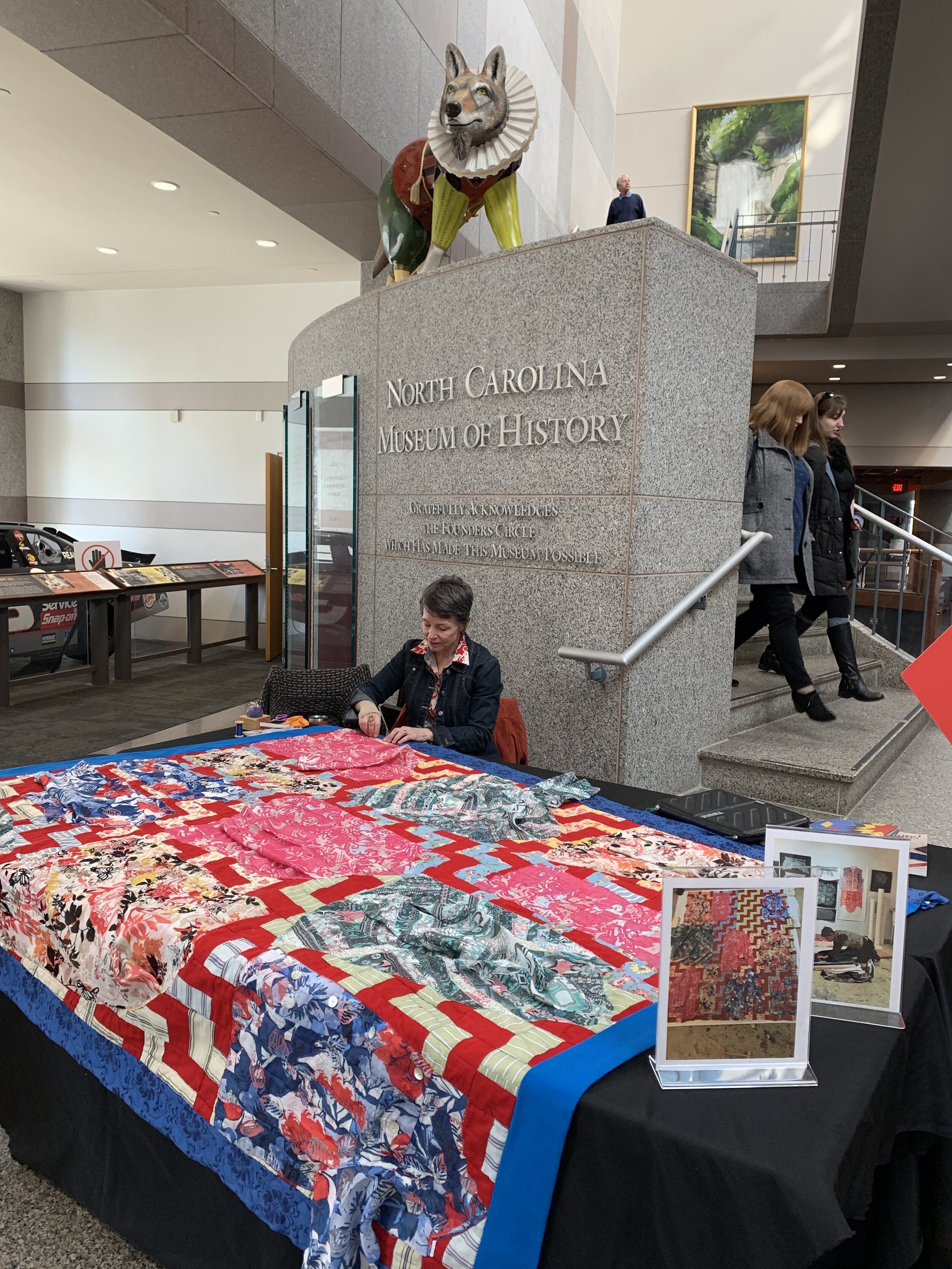
Here I am doing some final hand-sewing on the art quilt to attach a sleeve on the top back edge, so that the quilt can be displayed in exhibitions. As I worked in the lobby of the museum, I engaged with visitors who were curious about what I was making and why I was making it in such an unusual way. I particularly had fun talking with middle-school aged kids who were typically more aware of the environmental problems associated with clothing than their parents.
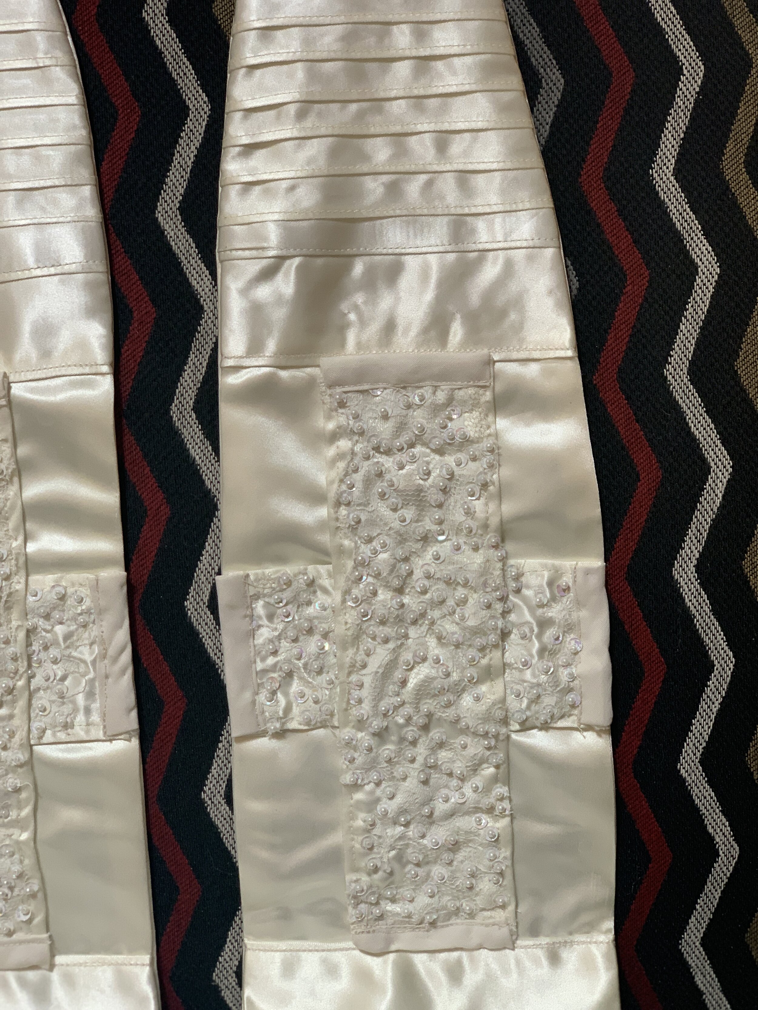
The visual focal point for the stole is the two crosses, created by layering sections of the heavily beaded lace and satin over plain satin.
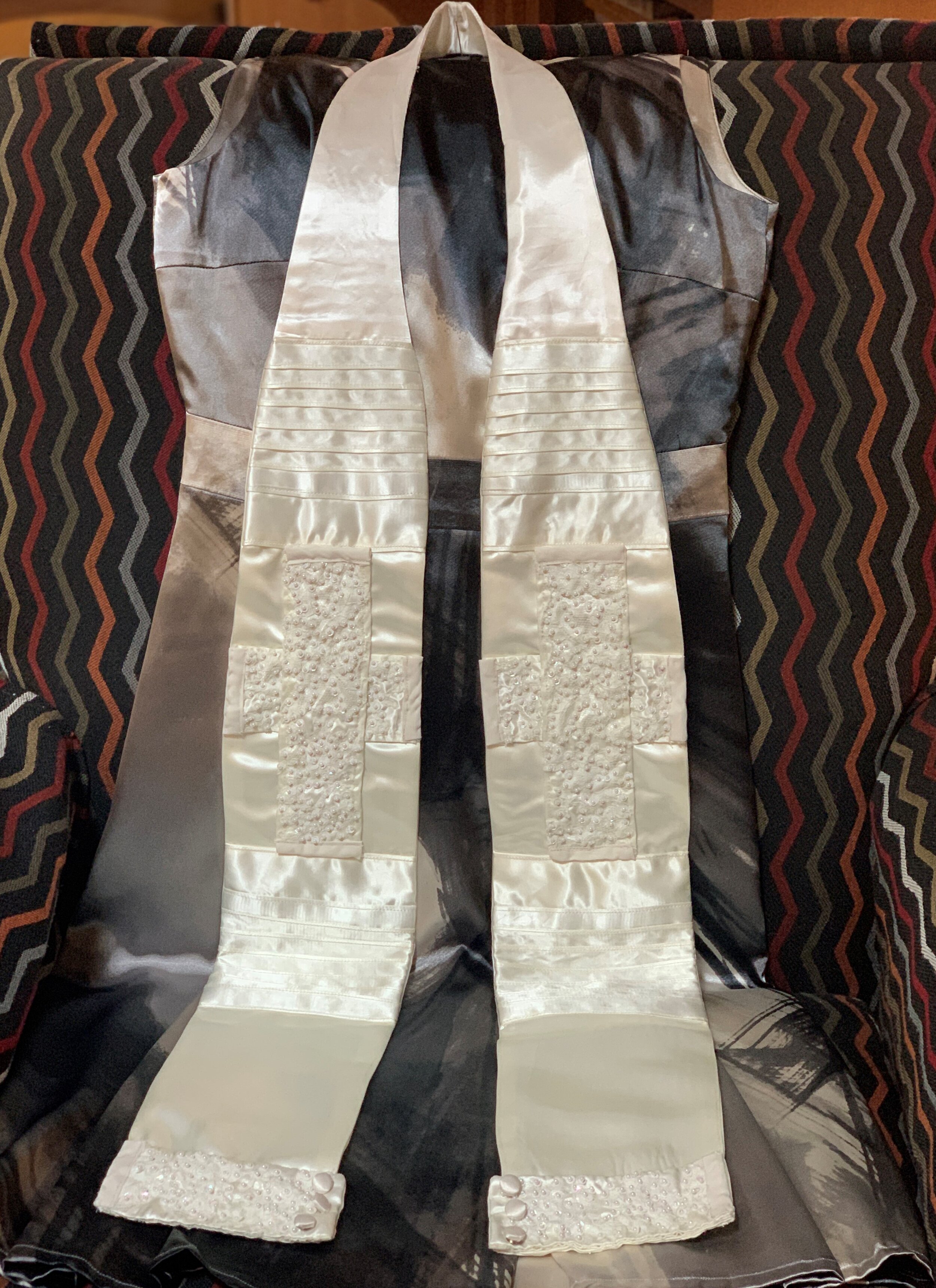
Commissioned by a bride-to-be for her sister, a Methodist Minister, to wear at her wedding, as she served as the officiant. This special stole was created from their mother’s wedding dress, which had been handmade by her mother. This this stole connected three generations of women in their family.
I first sketched some possible designs for the stole to be reviewed by the bride. I then created a pattern so the stole would properly fit the minister and be the right proportion to suit her and the dress she planned to wear for the occasion. I sought to use as many of the decorative elements as possible from the wedding dress, including pin tucks, hand-decorated lace with small pearls and sequins, and even the cuffs from the original dress. The simple cross form served as the primary focal point of the white on white stole.
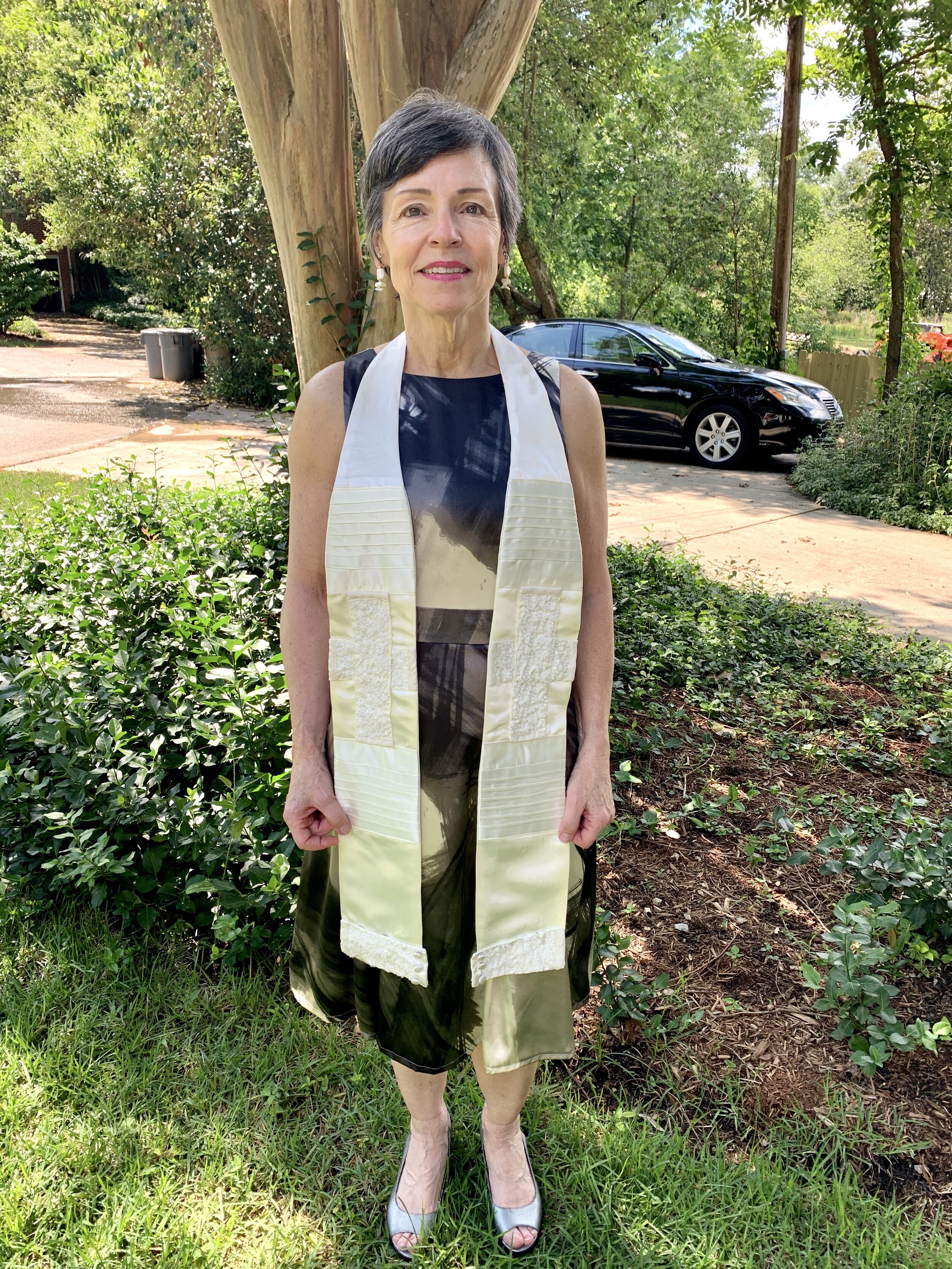
The wedding stole modeled.
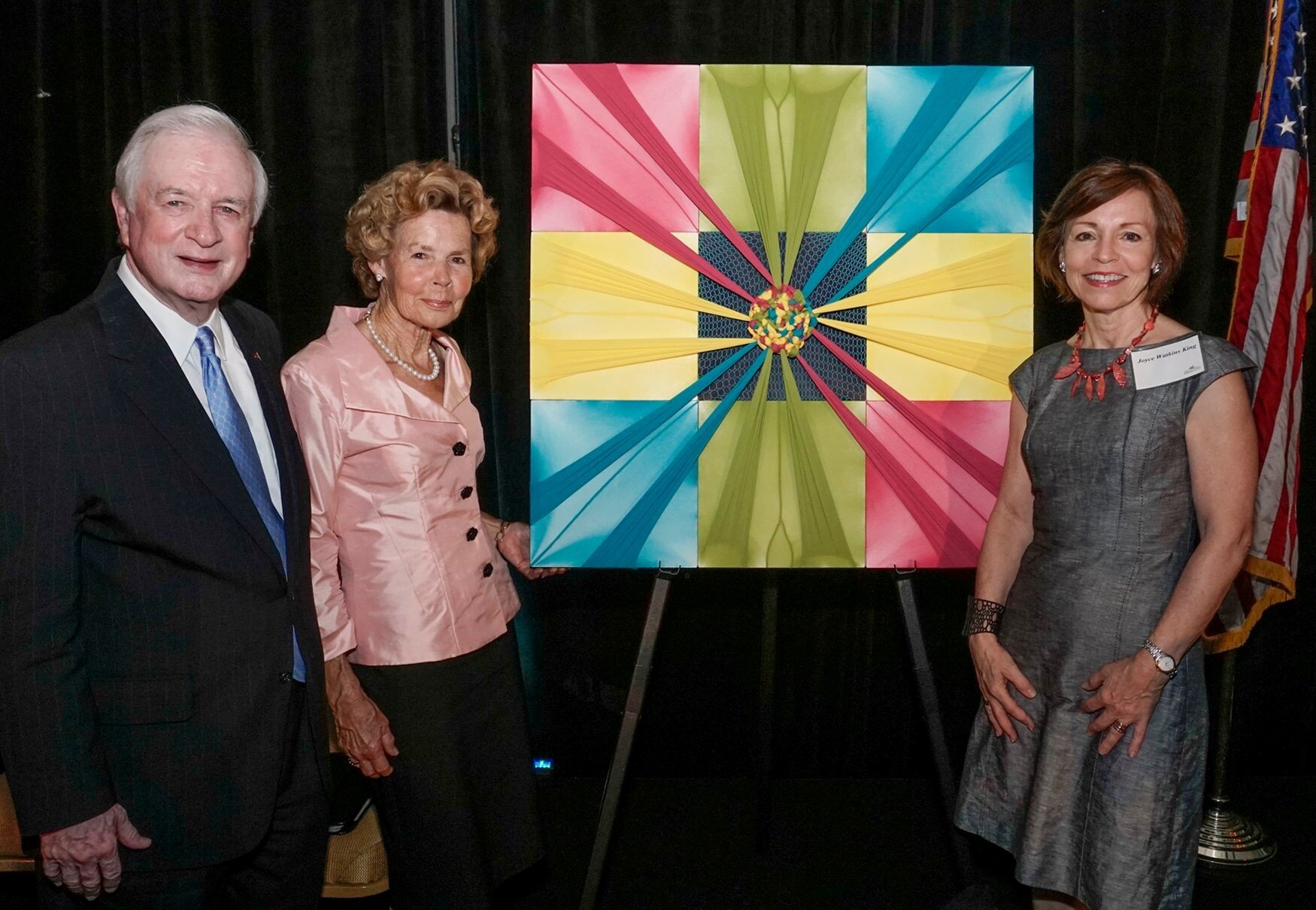
This work was commissioned by the Public School Forum of NC as an award to (former) Governor James B. and Carolyn Hunt for their support of NC education, in collaboration with the Institute for Emerging Issues (IEI) at NC State University. Governor Hunt is known locally and nationally as ‘the Education Governor,’ because of his life-long commitment to public education and service to the state of North Carolina. The IEI was founded by Governor Hunt more than two decades ago and he remains active in its work.
Created from hosiery and cradled boards, the textile art hangs in the main lobby entry to the Institute, now part of the James B. Hunt Library, an international award-winning building on the Centennial Campus of NC State University. Governor Hunt was instrumental in the gift of land to the university which became the Centennial Campus, providing it with countless opportunities for collaboration between the public land-grant university’s cutting-edge research and the private sector.
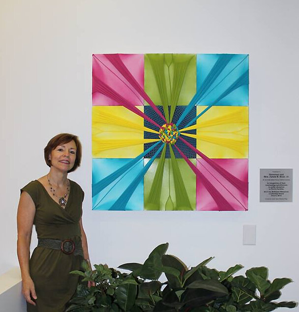
On-site photo of the commissioned artwork in the entry lobby to the IEI (Institute for Emerging Issues) in the James B. Hunt Library, Centennial Campus, NC State University.
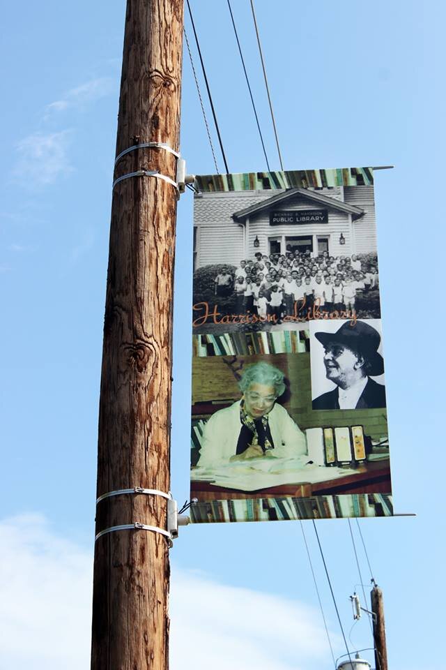
Commissioned by the City of Raleigh, NC Arts, this banner is one of ten created by Raleigh-based artists as part of the ”Art Along Blount Street ,” program. Each banner called attention to an historic building, business, school, or community that was/is part of a thriving African-American-focused section of downtown Raleigh. Other Raleigh agencies, like the DHC (Downtown Housing Community) did historic research on the area, documenting the current and former locations of AA built, owned, or developed institutions. An App was created to allow visitors to the historic section of Blount Street to learn more about each of the sites featured on the 10 stops.
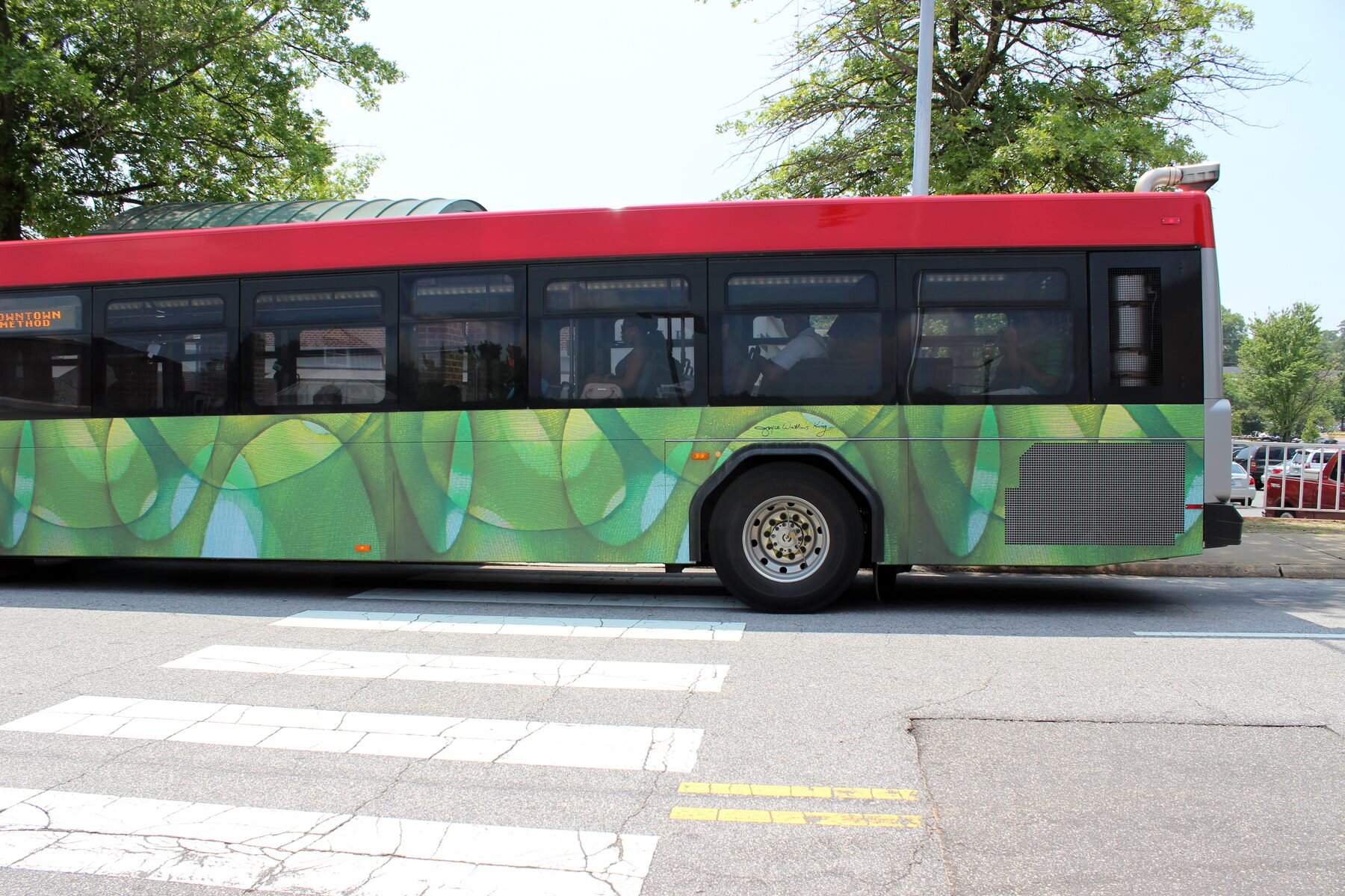
Commissioned by the City of Raleigh, NC, I based the digital design of this Go Raleigh bus, part of the new non-gasoline powered vehicles, on my original fiber art. I created the inspiration work by stretching three layers of hosiery over cradled boards and burning them to create flowing patterns. I titled the original work, “Hambidge Meadow,” because it was inspired by the vibrant green meadow in front of my home/studio during an artists residency at the Hambidge Center in northwest Georgia.
Apporoximately 18 x 24,’ I blew up the original by a scale of 4 verrtically and then carefully connected the horizontal sections together in Photoshop. The much larger scale show each of the small fibers in the hosiery yarn, that spun and then knitted together create a very strong, but sheer garment. I think there are parallels in our ecosystem. The green in the hosiery is also a reference to the “more green” mode of transportation (versus the old city buses).
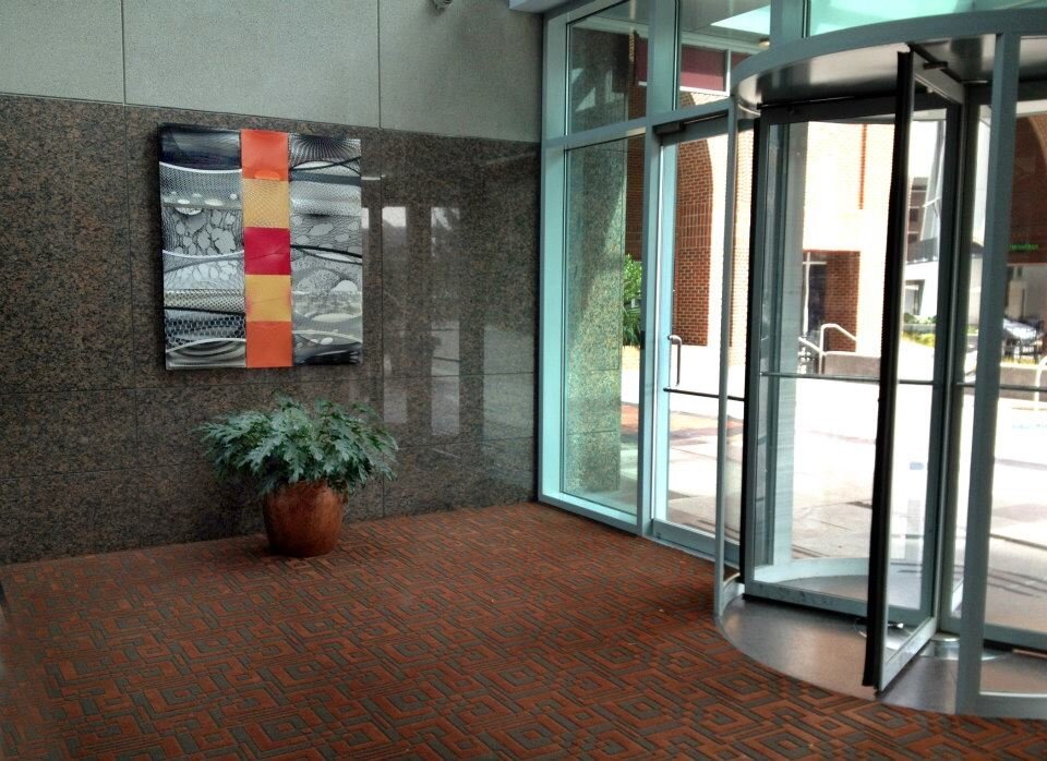
Commissioned by Capital Development for their 27 story Two Hannover Building in the heart of downtown Raleigh. Two fiber works, made from hosiery, paint and cradled boards, greet visitors from the Fayetteville Street entrance. The open two-story lobby has high-end, hard surfaces of tile, limestone, marble and steel. My goal was to offer a counter-balance with the use of soft materials that mirrored the geometry of the hardscape, but also offered some soft curvilinear imagery.
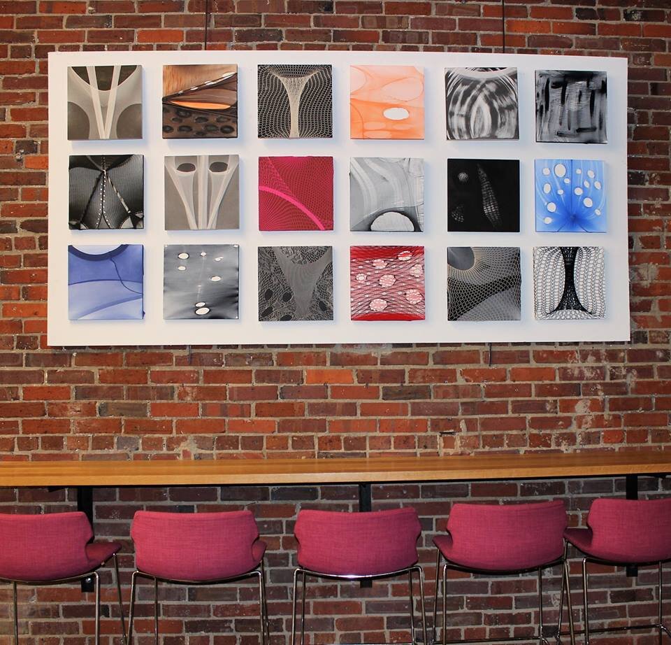
This fiber piece, made from hosiery, paint, and cradled boards is in the headquarters of Personify, an international recruitment and personnel search firm based in Raleigh, NC. This is one of several open gathering spots where employees can have a quiet conversation, eat their lunch or enjoy their coffee.

This pastel diptych was commissioned for the entrance lobby to FMI Corporation, an international management consultant firm to the construction industry and the largest provider of mergers and acquisition services. This piece is in The Dillon, a two and one-half block, 18-story multipurpose building in the historic warehouse district of downtown Raleigh. It is home to corporate offices, restaurants and retail, and luxury apartments.
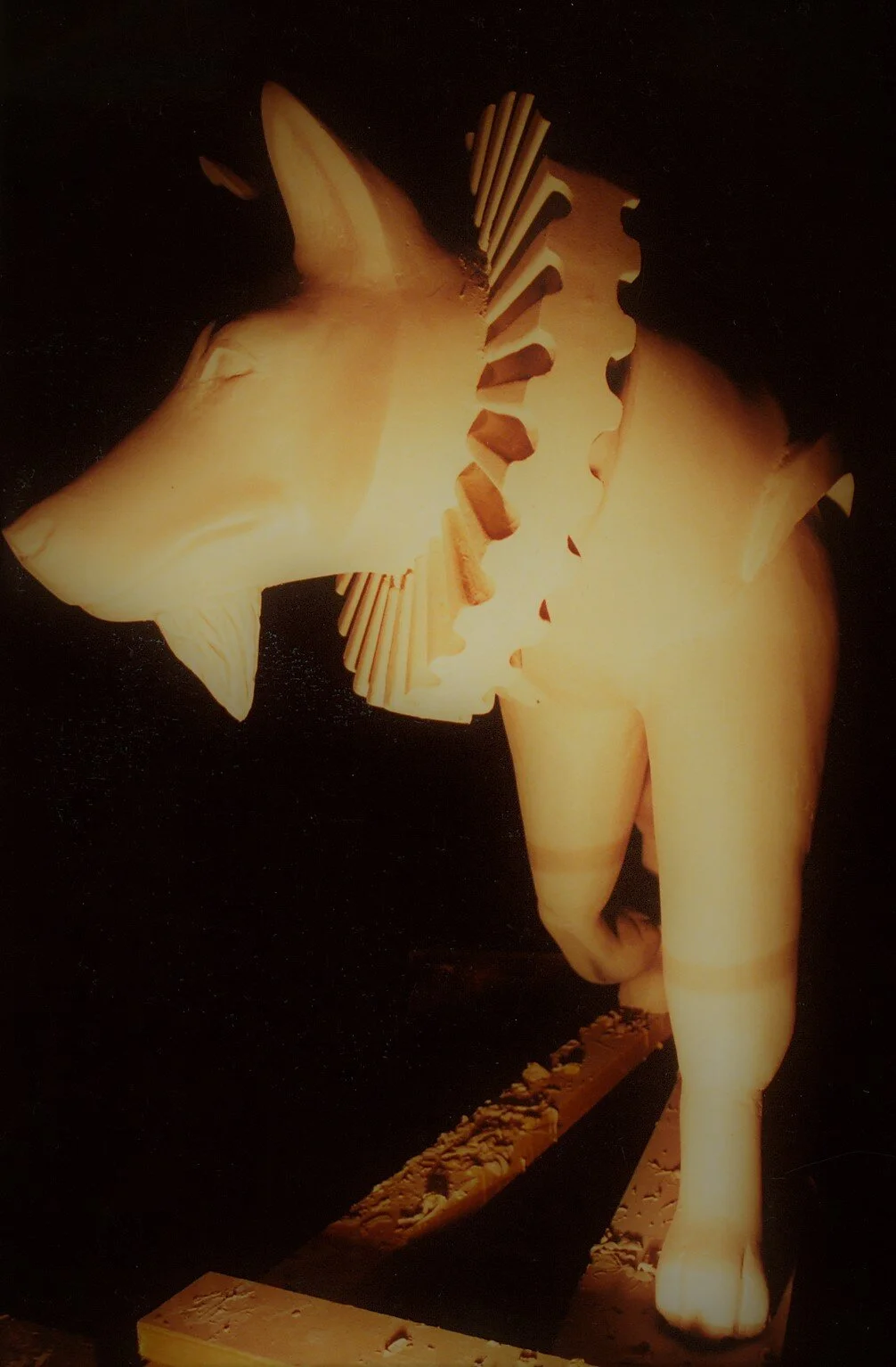
This image of Sir Wolfter illustrates how he looked after I added the ruff around his neck and the beard under his chin, prior to painting.
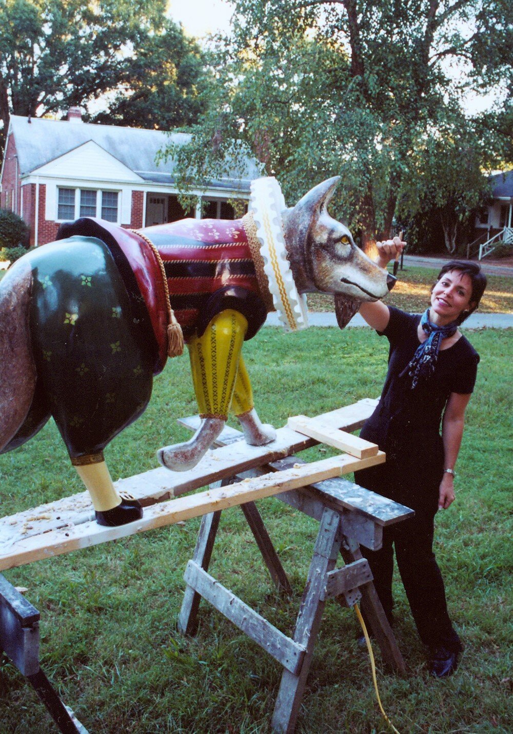
Here I am shown putting the finishing touches on the paint job. All that remained was the addition of his sword and his shoe buckles.
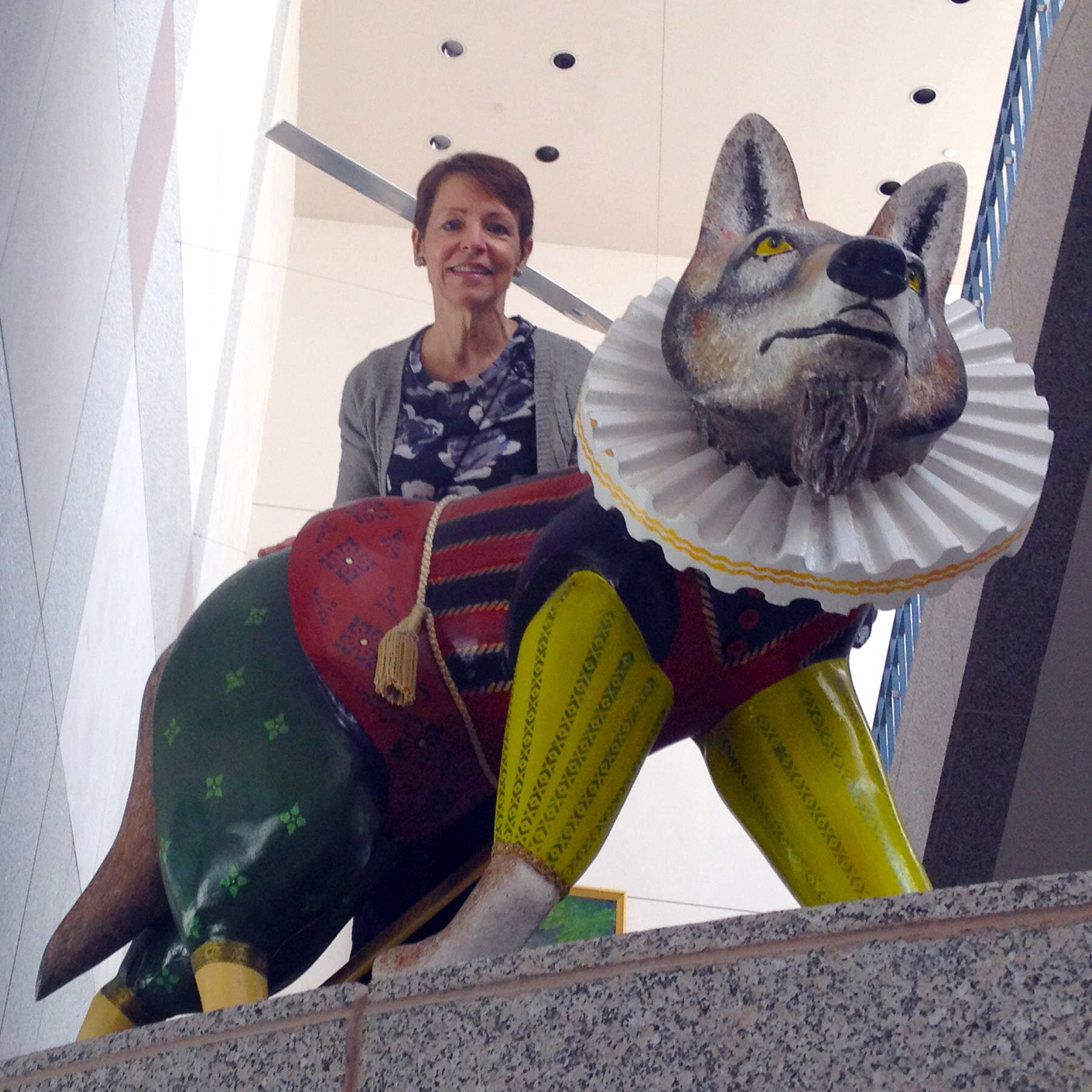
Sir Wolfter (and me) standing in his permanent location, at the entry to the NC Museum of History in Raleigh, NC
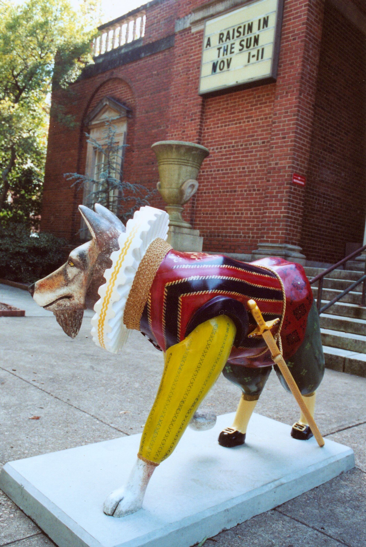
This was my first public art commission. Sir Wolfter Raleigh was one of about 100 wolves created by artists in Raleigh. Artists were invited to submit proposals and sketches for a proposed wolf, not unlike other major cities in the US. The “red” wolf was chosen because it was an endangered species that the department of natural resources was working to revive, and the wolf is the mascot for NC State University, the largest university in North Carolina.
I chose to focus my wolf on the character of Sir Walter Raleigh because some historians believe that he may have been the regaled Shakespeare writer, whose identity was never fully verified. It seemed befitting that such a wolf would be located in front of the student theatre at NC State, and thus the art department at the University chose to sponsor him. Alas, after the wolf was toppled from his concrete base after too many boisterous student riders, the sculpture was temporarily moved indoors in front of the box office. S
Several years later the sculpture was purchased by the NC Museum of History where he now greets visitors to the museum. He is a common prop for visiting student groups to surround for their class outing photograph.
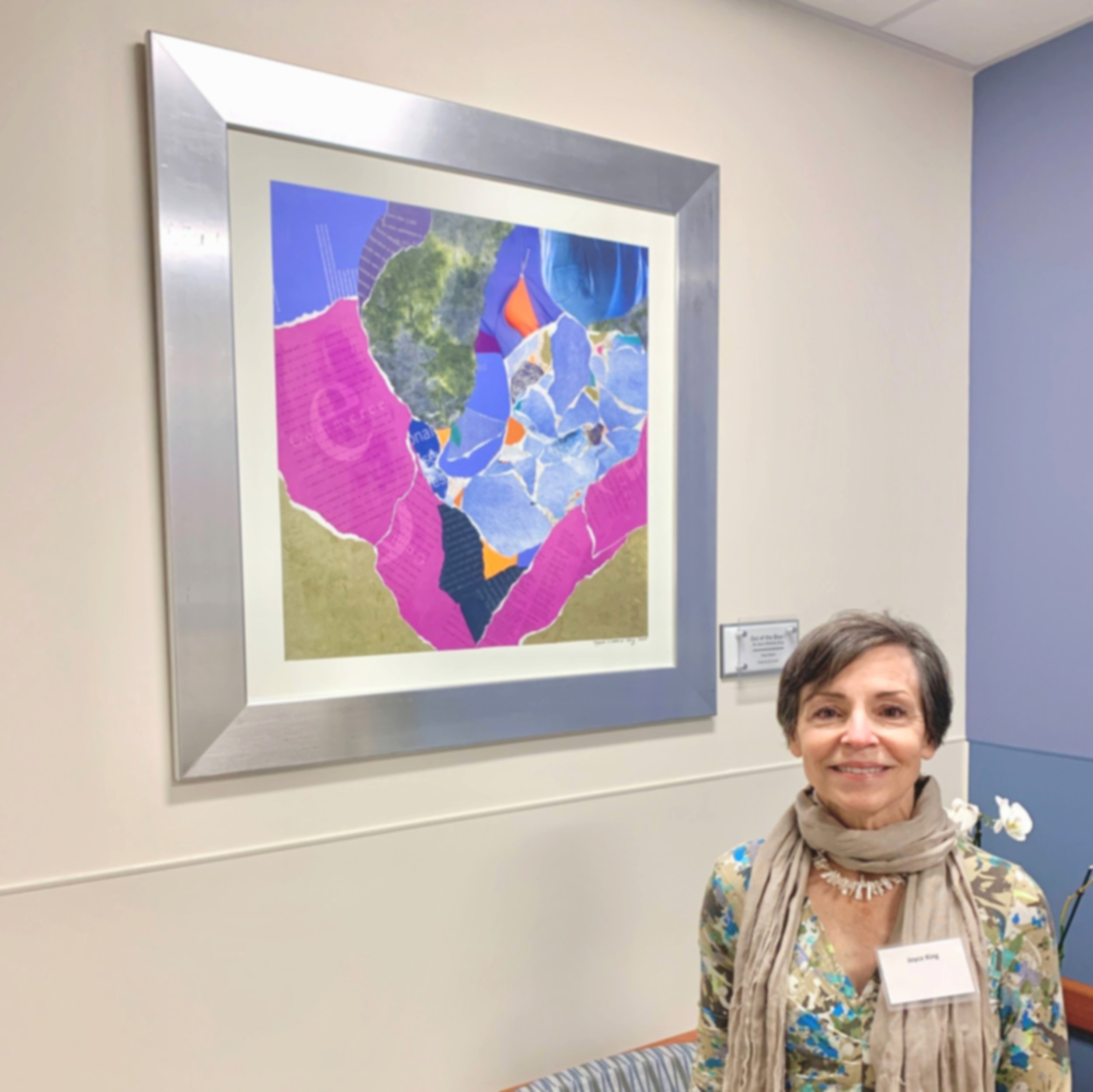
This mixed media piece was inspired by the purple and bright orange colors in a garment photograph placed in the upper right hand of the page and grew from there. I hope the soothing blues and purples will offer a sense of calm to patients waiting to be seen by an oncologist at the new Rex Health Cancer Center in Raleigh, NC.


Commissioned by Raleigh Arts, I created this digital artwork by printing tree/vest forms from deconstructed and reassembled used clothing: in this case a jacket purchased from a thrift store. The artwork will be used on one of about 10 new bus shelters in downtown Raleigh in September 2020.
After printing the top and bottom panels of the vest form, I added cut leaf shapes to fashion the leaves growing (spring and summer) and leaves falling (autumn and winter). I repeated the tree/vest forms to replicate the life cycle of all living things. The background of the tree forms will be clear glass so that bus riders can easily see the approaching busses.
This 4-panels installation (2 shown here) was commissioned by First Baptist Church, Grreensboro, NC for the newly renovated chapel. They wanted a visual focal point for the neutral multi-purpose space that would be compatible with the variety of uses: weddings, funerals, lectures, small performances/concerts, etc. In keeping with my personal ethic to use recycled materials whenever possible, I made the 2 back panels out of linen from recycled garments using an ancient Korean sewing technique called bojagi/pojagi. The technique leaves no raw seams and when bac-klit, looks much like a stained-glass window. The front panels carry the imagery of the grapevine, also made from re-used linen, and embroidered to a sheer non-woven fabric.
This is a view of the second half of the art installation. The top layer completes the grapevine imagery that flows from the first panel.
This image shows one of the two back bojagi/pojagi linen panels (84 x 52”).
One of the beauties of this layered work is that it looks different from nearly every point in the room. For example this is how it might look to a toddler who is looking up at it from a close angle. Likewise the art changes all throughout the day, depending on when the light is coming directly, indirectly, or not at all from the window behind the work.
This 4-layered art quilt was created in response to an invitation from the NC Museum of History to myself and two other artists, to create a quilt in response to the quilts on display in their 2020 year-long exhibition, “QuiltSPEAK: Uncovering Women’s Voices Through Quilts.” The exhibition of some 80 quilts from the permanent collection reveals the voices of women long-silenced. Their quilts provide lasting records of life events, economy, style, status symbols and artistry.
I chose to pay homage to these phenomenal quilts with a creation that acknowledged the past and present. I began with a hand-sewn quilt top made from left-over bits of cotton clothing, given to me as a high school graduation present. Lovingly made by the Eunice, the African-American woman who helped my mother out with ironing every few weeks, I had been saving it for more than 40 years, and this seemed like a fitting way to honor her gracious gift.
Layered over the quilt top I embroidered minimally deconstructed women’s blouses, made from polyester burn-out fabrics, that allowed the quilt top to show through. I chose these garments, gleaned from thrift shops and my own closet, because they represent the opposite of the soft, natural fabrics used in the quilt base. These polyester garments that are now filling up our landfills at alarming rates due to mass consumption and the availability of cheap, poorly made fast fashion garments represent the opposite of thrift.
I wanted to convey how quickly these garments are purchased, worn briefly, and often thrown out when something as simple as a button falls off or they are no longer in style. I left the sleeves dangling as if these garment had been thrown on a bed or piled on the floor—devalued by their owner.
The border and backing fabrics were made from one of my wool skirts and an old throw. Only the thread and the interior batting were purchased.
This view shows how the shirt sleeves hang freely from the quilt when it is displayed as art.
Here you can see how the polyester shirt panels have been layered over the old hand-pieced quilt top. The burn-out sections of the polyester fabrics allow the design of the quilt top to shine through.
Here I am doing some final hand-sewing on the art quilt to attach a sleeve on the top back edge, so that the quilt can be displayed in exhibitions. As I worked in the lobby of the museum, I engaged with visitors who were curious about what I was making and why I was making it in such an unusual way. I particularly had fun talking with middle-school aged kids who were typically more aware of the environmental problems associated with clothing than their parents.
The visual focal point for the stole is the two crosses, created by layering sections of the heavily beaded lace and satin over plain satin.
Commissioned by a bride-to-be for her sister, a Methodist Minister, to wear at her wedding, as she served as the officiant. This special stole was created from their mother’s wedding dress, which had been handmade by her mother. This this stole connected three generations of women in their family.
I first sketched some possible designs for the stole to be reviewed by the bride. I then created a pattern so the stole would properly fit the minister and be the right proportion to suit her and the dress she planned to wear for the occasion. I sought to use as many of the decorative elements as possible from the wedding dress, including pin tucks, hand-decorated lace with small pearls and sequins, and even the cuffs from the original dress. The simple cross form served as the primary focal point of the white on white stole.
The wedding stole modeled.
This work was commissioned by the Public School Forum of NC as an award to (former) Governor James B. and Carolyn Hunt for their support of NC education, in collaboration with the Institute for Emerging Issues (IEI) at NC State University. Governor Hunt is known locally and nationally as ‘the Education Governor,’ because of his life-long commitment to public education and service to the state of North Carolina. The IEI was founded by Governor Hunt more than two decades ago and he remains active in its work.
Created from hosiery and cradled boards, the textile art hangs in the main lobby entry to the Institute, now part of the James B. Hunt Library, an international award-winning building on the Centennial Campus of NC State University. Governor Hunt was instrumental in the gift of land to the university which became the Centennial Campus, providing it with countless opportunities for collaboration between the public land-grant university’s cutting-edge research and the private sector.
On-site photo of the commissioned artwork in the entry lobby to the IEI (Institute for Emerging Issues) in the James B. Hunt Library, Centennial Campus, NC State University.
Commissioned by the City of Raleigh, NC Arts, this banner is one of ten created by Raleigh-based artists as part of the ”Art Along Blount Street ,” program. Each banner called attention to an historic building, business, school, or community that was/is part of a thriving African-American-focused section of downtown Raleigh. Other Raleigh agencies, like the DHC (Downtown Housing Community) did historic research on the area, documenting the current and former locations of AA built, owned, or developed institutions. An App was created to allow visitors to the historic section of Blount Street to learn more about each of the sites featured on the 10 stops.
Commissioned by the City of Raleigh, NC, I based the digital design of this Go Raleigh bus, part of the new non-gasoline powered vehicles, on my original fiber art. I created the inspiration work by stretching three layers of hosiery over cradled boards and burning them to create flowing patterns. I titled the original work, “Hambidge Meadow,” because it was inspired by the vibrant green meadow in front of my home/studio during an artists residency at the Hambidge Center in northwest Georgia.
Apporoximately 18 x 24,’ I blew up the original by a scale of 4 verrtically and then carefully connected the horizontal sections together in Photoshop. The much larger scale show each of the small fibers in the hosiery yarn, that spun and then knitted together create a very strong, but sheer garment. I think there are parallels in our ecosystem. The green in the hosiery is also a reference to the “more green” mode of transportation (versus the old city buses).
Commissioned by Capital Development for their 27 story Two Hannover Building in the heart of downtown Raleigh. Two fiber works, made from hosiery, paint and cradled boards, greet visitors from the Fayetteville Street entrance. The open two-story lobby has high-end, hard surfaces of tile, limestone, marble and steel. My goal was to offer a counter-balance with the use of soft materials that mirrored the geometry of the hardscape, but also offered some soft curvilinear imagery.
This fiber piece, made from hosiery, paint, and cradled boards is in the headquarters of Personify, an international recruitment and personnel search firm based in Raleigh, NC. This is one of several open gathering spots where employees can have a quiet conversation, eat their lunch or enjoy their coffee.
This pastel diptych was commissioned for the entrance lobby to FMI Corporation, an international management consultant firm to the construction industry and the largest provider of mergers and acquisition services. This piece is in The Dillon, a two and one-half block, 18-story multipurpose building in the historic warehouse district of downtown Raleigh. It is home to corporate offices, restaurants and retail, and luxury apartments.
This image of Sir Wolfter illustrates how he looked after I added the ruff around his neck and the beard under his chin, prior to painting.
Here I am shown putting the finishing touches on the paint job. All that remained was the addition of his sword and his shoe buckles.
Sir Wolfter (and me) standing in his permanent location, at the entry to the NC Museum of History in Raleigh, NC
This was my first public art commission. Sir Wolfter Raleigh was one of about 100 wolves created by artists in Raleigh. Artists were invited to submit proposals and sketches for a proposed wolf, not unlike other major cities in the US. The “red” wolf was chosen because it was an endangered species that the department of natural resources was working to revive, and the wolf is the mascot for NC State University, the largest university in North Carolina.
I chose to focus my wolf on the character of Sir Walter Raleigh because some historians believe that he may have been the regaled Shakespeare writer, whose identity was never fully verified. It seemed befitting that such a wolf would be located in front of the student theatre at NC State, and thus the art department at the University chose to sponsor him. Alas, after the wolf was toppled from his concrete base after too many boisterous student riders, the sculpture was temporarily moved indoors in front of the box office. S
Several years later the sculpture was purchased by the NC Museum of History where he now greets visitors to the museum. He is a common prop for visiting student groups to surround for their class outing photograph.
This mixed media piece was inspired by the purple and bright orange colors in a garment photograph placed in the upper right hand of the page and grew from there. I hope the soothing blues and purples will offer a sense of calm to patients waiting to be seen by an oncologist at the new Rex Health Cancer Center in Raleigh, NC.